


Graphic Design of Little Flowers of St. Francis
Supervisor:
Professor Maciej Buszewicz
Studio of Book Design
///
I do not remember when the Little Flowers of St. Francis found its way into my hands
for the first time. Just like in a cartoon, I stretch out my hands and bam! In my hands
I hold a bouquet of wild flowers gathered on a meadow, somewhere near Assisi.
Not really. I do not even remember if I read Brandstaetter’s The Other Little Flowers
of St. Francis or the original book first. Anyway, friar Juniper and the stories of his
deeds belong to my favourite parts of that book. Little Flowers is a heterogeneous
piece, although most texts are attributed to friar Ugolino of Montegiorgio.
Actus beati Francisci et sociorum eius is the Latin title of this collection, written
down in the fourteenth century for the first time. A Polish translation by Leopold Staff
was published in 1910, in light, not overly archaic, and beautiful Polish language.
Thanks to Ola Dębniak I have read this book anew.
Ola, as she admits herself, selected this particular book for her degree piece almost
without reading it, led by intuition and her fascination with the formal complexity
of this collection. Great choice, blessed be such extraordinary intuition!
At the moment I am leafing through one of four existing copies of this edition,
Aleksandra Dębniak’s masterpiece, her 2011 degree piece with rector's prize
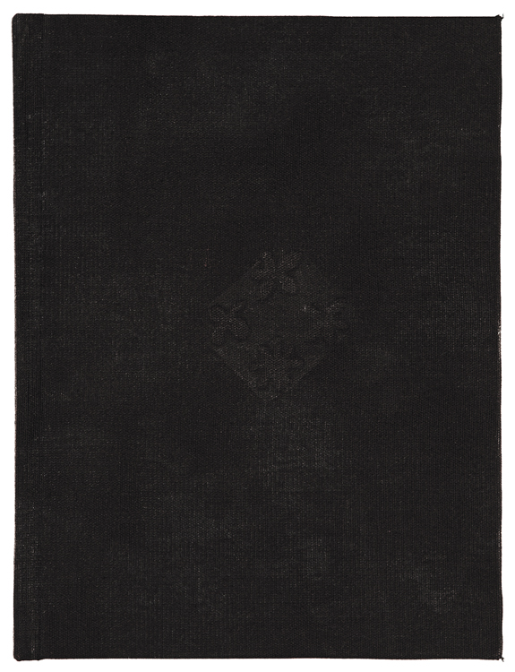
from the Academy of Fine Arts in Warsaw. The book is bound in black linen with relief
print on the cover and it is 256 print pages long. One would like to say, old print.
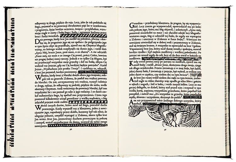
From the very first page the reader is enchanted by letters and pictures imprinted
on yellowish paper from lead forms and woodcut blocks, using a wine press which
has been transformed into a printing press. When was it printed? Antiqua, which
we use today, appeared in Venetian prints with the printer’s mark in the form of
a dolphin on an anchor as early as in the fifteenth century, some 100 years after
the Italian translation of Little Flowers. On the margins we find texts in Manutius’
cursive, used for the first time probably in 1503, hence called italic.
But on the second page we find Gothic script. It is neither Bastarda, nor Textura,
nor Schwabacher. It is neo-Gothic lettering, probably from the nineteenth century.
More Gothic than Old English black letter, like neo-Gothic churches around
the world, even those made of concrete, are more Gothic than Vistula Gothic.
Heavy metal St. Francis?
Beautiful, woodcut ornaments finely introduced into the text, complementing the lines.
No, rather cast in lead, already heavily damaged copies of woodcut originals.
There are a considerable number of them, so only a wealthy printer could have
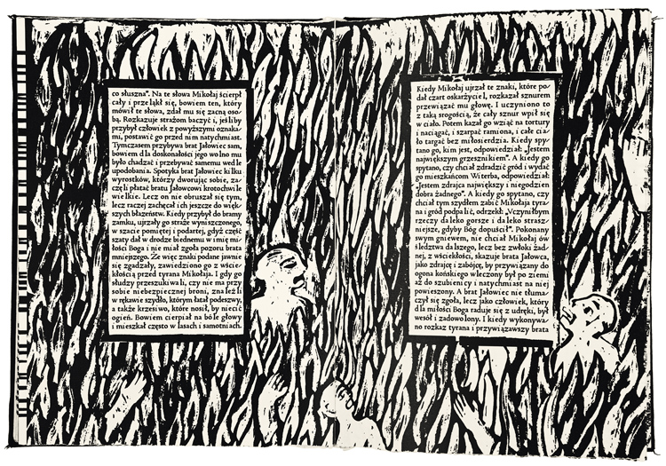
afforded to imprint these pages. And then, the beautiful woodcuts. Sixteenth century,
or perhaps trashy prints from the eighteenth or nineteenth century? Polish!
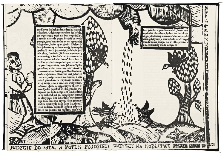
It is enough to look at the spread on pages 200-201.
“Eat your fill, and then we all go to prayer.” If you read carefully, it turns out that these
are the words of friar Juniper from the parable about how he cooked food for two
weeks at once. You can find this text on the previous page. The next question
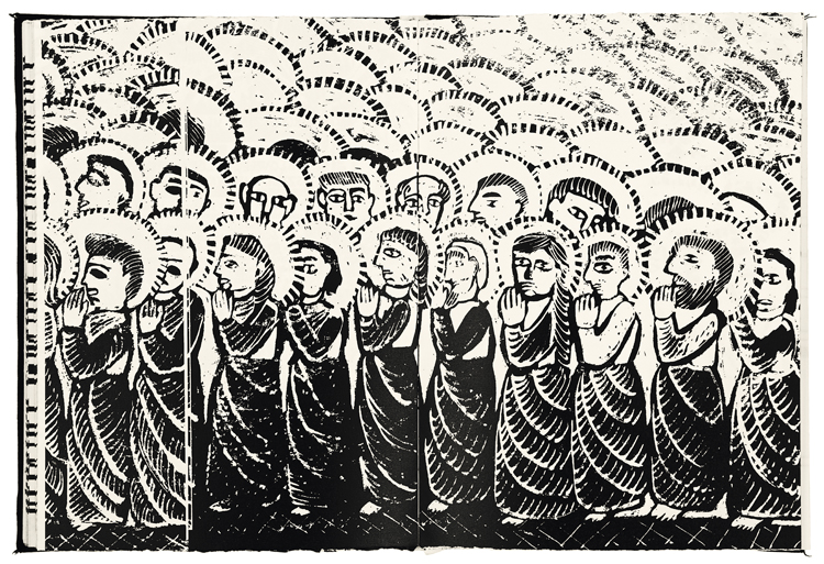
that comes to mind is about the size of the graphics, as a small fragment takes up
a whole two-page spread. How great the former wine press must have been!
In the book block lies a little miracle. When you lift the cover, grab all the pages
at once, carefully bend into an arc and… there is a “heavy metal tattoo”, praising
the Franciscan virtues: “poverty, chastity, obedience”. And in this manner we are
led by the nose by Ola Dębniak, from the first, to the very last page.
A piece planned in a modern way, one would like to say, in a post-postmodern way,
and executed with extraordinary results.
How does such a book come into being? Searching libraries, studying structure
and composition, analysing the nature of old prints, both religious and secular,
digging through hundreds of websites in search of examples of composition
solutions in woodcuts, ways of presenting the landscape, human figures or
a Giotto-like perspective. And of course the author developed three of her own,
original fonts, inspired by the Polish old prints. Only the “heavy metal” font was
borrowed. The woodcuts were created and aged by computer. All the broken types
and other print defects which were created on the computer are so reliable because
Ola Dębniak perfected classical graphic techniques. The appendix to her degree
piece, prepared in Professor Ewa Walawska’s studio, proves this proficiency.
One would like to say, pretty little flowers. But that is not enough. Not only pretty,
but addictive, compelling to read, reflecting perfectly the atmosphere of the era
and nature of the text. Amen.
B. 1986, studied at the Faculty of Graphic Arts of the Academy of Fine Arts in Warsaw
(2006–2011).
CONTACT:
T: +48 667 940 087
oladebniak@gmail.com


partnerzy
patronat medialny

